Smothis: A Display Font That Feels Like a Design Secret
It was 10:47 a.m., third day into a branding refresh for a small-batch ceramic studio—hand-thrown mugs, earthy glazes, quiet confidence—and I’d just opened a fresh brand board in Figma. The client loved “warm but intentional,” “crafted but not fussy.” I’d already cycled through three serif options (too traditional), two geometric sans (too sterile), and one script that looked like it belonged on a wedding invitation, not a functional mug label. Then I dropped Smothis onto the logo placeholder—and paused.
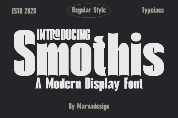
That’s the thing about Smothis: it doesn’t shout. It settles in. It’s a display font with presence, yes—but also poise. Think soft curves with subtle tension, open counters that breathe, letterforms that feel both hand-guided and precisely engineered. There’s no forced quirk or exaggerated contrast. Instead, it balances organic rhythm with clean structure—like a skilled potter’s thumbprint left just visible in the clay. It’s warm without being cutesy, modern without feeling cold, distinctive without demanding attention.
Where Smothis Shines (and Where It Steps Back)
I tested Smothis across every touchpoint I could simulate: logo lockup, business card, product label mockup, Instagram carousel headline, website hero banner, and even a printed poster at 24” x 36”. Here’s what held up—and where I reached for something else.
In logo design, Smothis worked beautifully as a primary mark—especially when set alone or paired with a minimal wordmark in a neutral sans. Its lowercase “a” and “g” have gentle personality, and the uppercase “S” has a graceful, unhurried flow. On a ceramic mug label? Perfect. Legible at 14pt on matte paper, with enough character to reinforce craft without competing with texture or form.
For packaging design and product labels, Smothis excelled in short bursts: “Stoneware • Made in Portland,” “Dishwasher Safe,” “Small Batch • Fired Daily.” It added warmth and authenticity—no digital sterility, no vintage cliché. But I wouldn’t use it for ingredient lists or care instructions. It’s not built for dense, functional text. That’s fine. That’s its job description.
In web design, Smothis performed well in hero headers and section titles—especially when loaded as a webfont with appropriate fallbacks. At 48–64px on desktop, it felt grounded and inviting. At smaller sizes (<32px), legibility softened, particularly on lower-DPI screens. So I kept body copy in a highly readable sans (Inter, in this case) and used Smothis strictly for hierarchy and tone.
Social media graphics were where Smothis surprised me most. On an Instagram post announcing a new glaze drop, the font gave the headline instant warmth and cohesion—no extra styling needed. It didn’t fight the photo; it complemented it, like choosing the right frame for a sketch.
What It’s Not—and Why That Matters
Smothis is not a workhorse font. It’s not meant for long paragraphs, legal disclaimers, or spreadsheet headers. It’s not a corporate rebrand font for a financial services firm—or even a tech startup aiming for razor-sharp clarity. It’s also not a script or handwritten font, though it shares some of their approachability. It’s a display font, full stop: designed for impact, mood, and memorability in controlled doses.
If your project needs versatility across dozens of applications—from email footers to PDF manuals—you’ll want a robust type system, not a single standout. Smothis thrives when you give it space to breathe and intention behind its use.
Pairing Smothis Thoughtfully
I paired Smothis with three different companions during testing:
- A warm, low-contrast serif font (Cormorant Garamond) for editorial layouts—great for studio newsletters or lookbook captions.
- A neutral, humanist sans serif font (Poppins) for UI elements, navigation, and supporting text. Clean contrast, zero friction.
- A restrained script font (only for very occasional accents—like a signature line on a thank-you card). Used sparingly, it deepened the handmade feel without tipping into whimsy.
The key? Let Smothis lead the emotional tone, then support it with something legible, dependable, and quietly confident.
Before You Commit: Practical Notes
Smothis ships with a single weight (Regular), no italics or bold variants—but it includes thoughtful alternates and ligatures that add nuance without clutter. No swashes or decorative extras, which I appreciated—it stays focused. It supports Latin-based languages (including accented characters common in English, French, Spanish, and German), but check multilingual needs if your audience extends beyond that scope.
File formats include OTF and WOFF2—so it’s ready for both print and web use. But here’s the non-negotiable: always verify the commercial font license before using Smothis in client work. That means checking whether your license covers packaging, merchandise, templates, SaaS platforms, or print-on-demand products. Some licenses restrict certain uses—and it’s far easier to confirm upfront than explain a font replacement mid-project.
One last note: test early, test often. Drop Smothis into your actual layout—not just a font menu preview. See how it holds up next to photography, color blocks, or textured backgrounds. Print a business card mockup. Zoom out on your website header. Ask a colleague to glance at it for three seconds: what’s the first impression? Smothis earns trust slowly—not by shouting, but by feeling unmistakably *right* in the places it’s meant to live.